Pet Feeder Redesign
- Time:
- Four weeks.
- Collaboration:
- Member of a three person group.
- Tools:
- Figma, Illustrator.
Problem
Wopet’s pet feeder companion app is poorly designed - lacks aesthetic direction, has unclear intentions, and is confusing for the client.
Solution
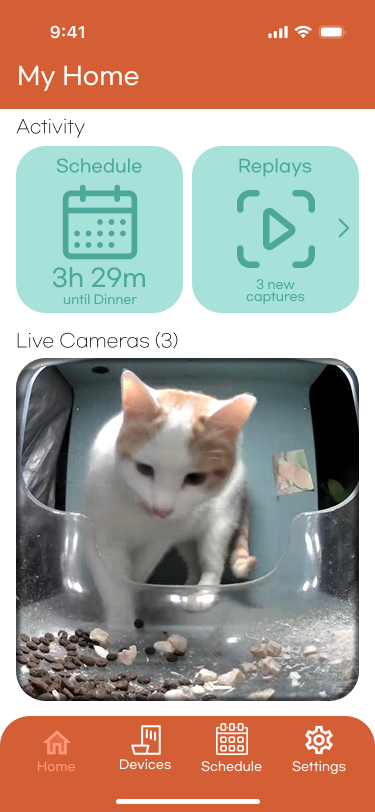
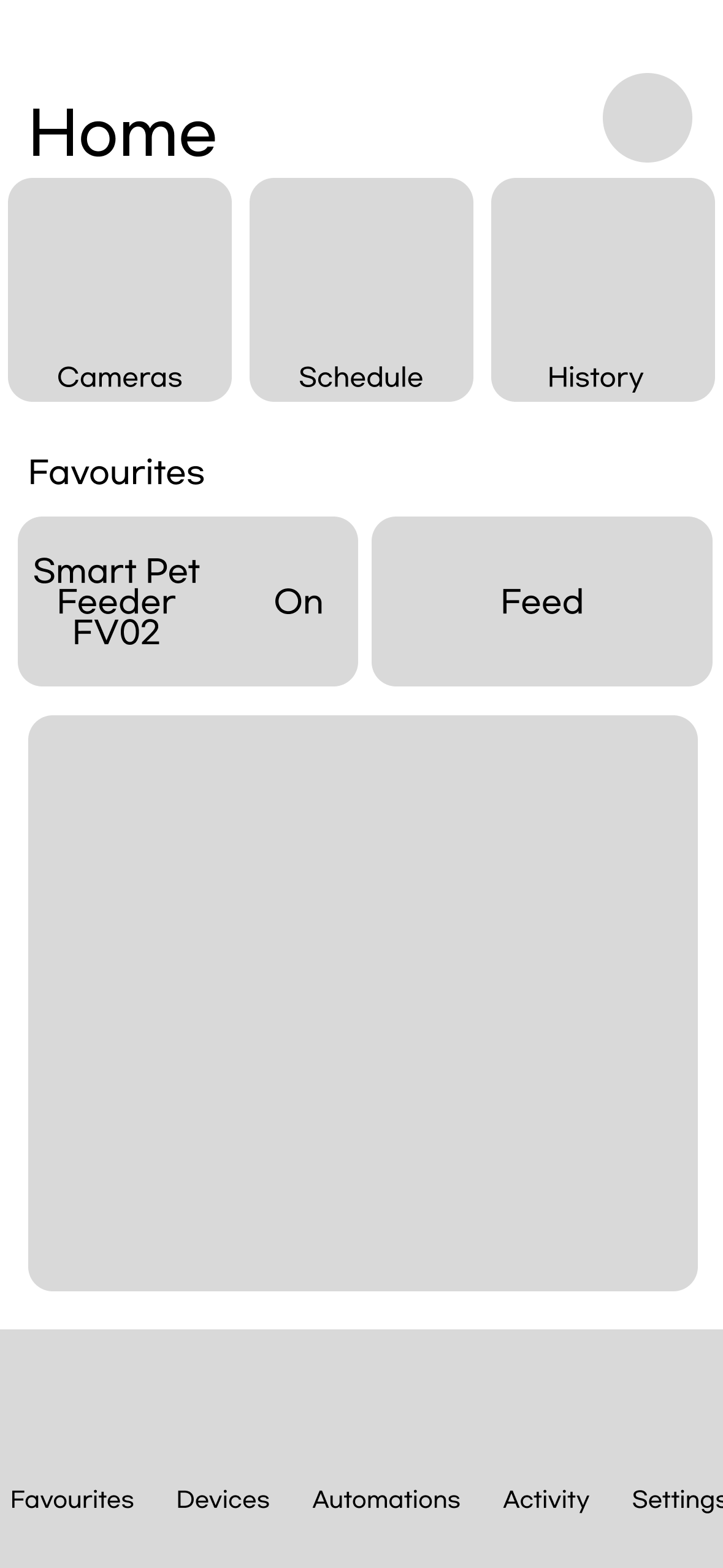
A smart feeder app prototype with a modular user interface with condensed but readable pages.
After conducting a competitor analysis of competitors in the pet feeder space, our design goals for this project were:
- Create a user-friendly experience with clear, simple language
- Use a balanced color scheme inspired by smart home apps like Google Home
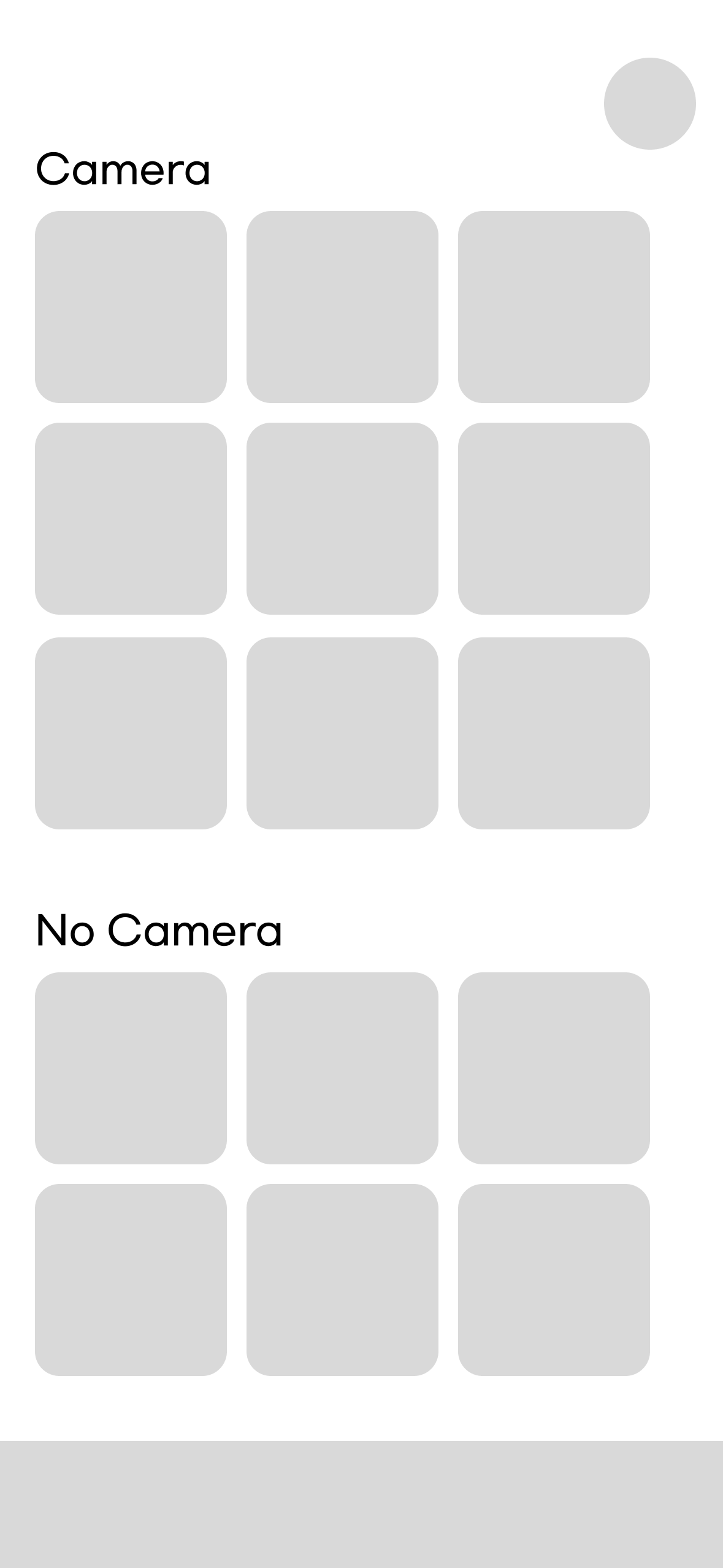
- Streamline navigation by consolidating pages
- Reduce clicks for a more efficient user flow

Reflections
Hierarchy is important - The original app was unusually confusing because of its organization and its confusing verbiage. Making sure the labels, headings and subheadings were accurate in our redesign helped make the app feel less disjointed.
Competitor analysis played a major role in the development of this application. We identified common positive traits of apps in the hardware companion market (especially the modular-style interface) and reinforced them in our final iteration.
Balancing clarity and descriptiveness - The app’s modular redesign and flat, balanced colors help to keep unnecessary clutter off of the screen.